Weber and Wright at Plan B
By • July 26, 2011 0 1438

When I look at Mike Weber’s work, I sense the subjects of the late 19th- and early 20th-century photographs he incorporates into his work have been displaced into a contemporary setting where they are perfectly content and at ease. There is an enchanting mysteriousness to the work. Weber says, “I focus on subtle facial expressions of my subjects and many are looking at the camera or photographer as if it was the first time they had been exposed to a camera.” In less capable hands, the subjects could have been soulless, but Weber is able to create hosts who offer the viewer access to the artist’s own deft craftsmanship.
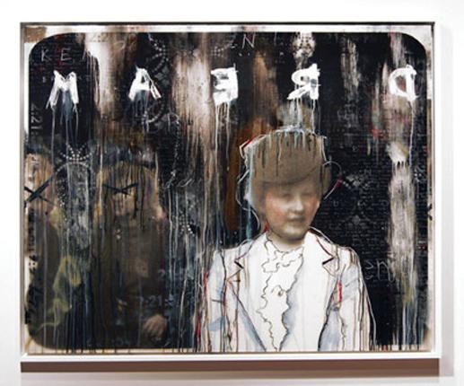
Weber hand paints or stencils letters into the work with quietness that does not overpower the central figurative themes. Even in the piece “In a Broken Dream,” where the word DREAM is painted backward and prominently across the picture, the viewer’s gaze doesn’t fixate but moves through the entire piece, taking note of Weber’s masterful use of dripped paint, pencil markings and color. One of the most interesting aspects of Weber’s pieces are the calligraphic lines he scrawls around the edges or over the photos. These black, red, blue or gold lines unify the work and fuse the sepia photos into the overall picture plane.
Jason Wright’s “Heartland” series is displayed opposite Weber’s and provides a good counterpoint. Write applies his paint impasto with a pallet knife, creating commanding, austere pieces. Like Weber, Wright generates a sense of mystery in his work, but with buildings on a landscape that verge on silhouette instead of portraiture. I sense he plans each picture carefully and then executes them in a quick, confident manner. From the titles such as “We Are Not the Same,” “Together” and “Nostalgias of Another Life,” one concludes these paintings are allegory and Wright confirms this by saying, “I wanted my work to haunt the viewer and evoke questions about their own feelings when it comes to a home.”
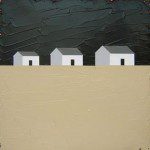
At first glance, three colors dominate Wright’s work: black, white and tan. He applies classic composition principles and linear ruled shapes that meet abruptly, creating scenes reminiscent of houses standing alone or in groups on desert or farmland horizons. All this happens in the central picture plane which gives way to something else: light. On the edges of the pictures, Write has left or painted in pinkish flakes that draw the viewer’s eye around the painting before resting again on the austere central theme of the work. The stark contrast of hue, value and intensity Write creates by juxtaposing tans, whites and blacks at the center of the pieces against the pinks on the edges gives his work vibrancy, charm and that little surprise that keeps a viewer’s attention.
The exhibits are on display at Plan B Gallery (1530 14th St.) until Aug. 29.
- Mike Weber, “In A Broken Dream,” mixed media, canvas on board and resin coated, 48×60


