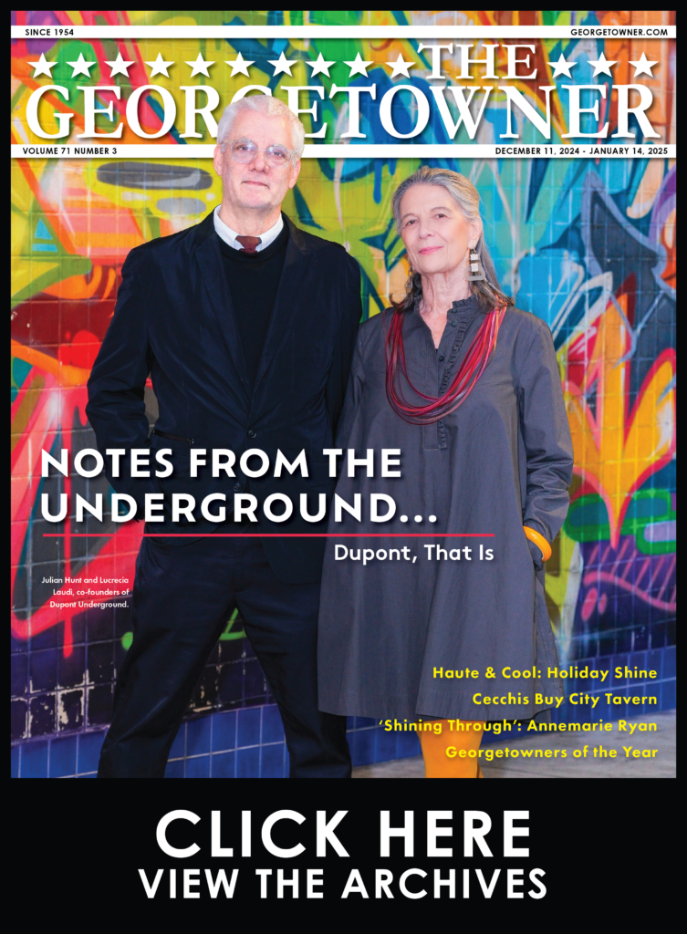
Lichtenstein Blockbuster Proclaims Power of Print
By • August 15, 2013 0 1971
Of all the painters I can think of, none seem to grate on the nerves of people I know quite like Roy Lichtenstein. They might roll their eyes at the abstract dribblings of Jackson Pollock or seethe at one of John McCracken’s plywood plank sculptures leaning against a wall — which is exactly what it sounds like — but never is there such a mix of exasperation, perplexity and annoyance as when they confront one of Lichtenstein’s colossal comic book panels in a museum gallery.
The whole situation is preposterous to them, for in truth the paintings do often look out of place. Each one is eternally stranded in its own little world—these vein and diluted cartoons, embroiled forever in their melodramas of love, longing, domesticity or enemy airstrike. They do not cooperate with other paintings around them, they stick out.
The initial disillusionment is usually in thinking that Lichtenstein just copied a bunch of stuff from newspapers and comic books, with a certain wit and panache. But this reaction stems from a deeper root: a lot of people have a hard time accepting this as high art. It isn’t quite absurd, but it can’t possibly be serious. It does not fall into the parameters of abstraction or realism—it’s more of a pliable schism. It has no real atmosphere or painterly richness (save for a sort of prepackaged 1950s nostalgia and a handful of tawdry brushstrokes), nor is it purely conceptual. And the compositions are weird.
Even by the steely Warholian standards of Pop art—the movement that Lichtenstein conceived with the very comic book paintings that brought him his fame in the early 1960s—his work floats alone in a bubble of unflattering self-effacement. Before our eyes, it seems to be rubbing itself out against the endless stream of media and mundane cultural symbolism that it has appropriated, like Snoopy bouncing between the funny pages and MetLife insurance commercials.
Yet, here it is. The National Gallery’s major fall exhibition: a monumental retrospective of the paintings of Roy Lichtenstein. His artwork has enjoyed uncommon success and still fetches dizzying prices at auction. Over the course of his career, his work has been the subject of more than 240 solo exhibitions (the last full survey organized by the Guggenheim in 1993). Some audiences tend to be irrationally, blindly adoring of him. Others would toss his work in the recycling with the Saturday Evening Post.
Both polarizing and encumbering, Lichtenstein’s work often feels like it is beyond specific scrutiny simply by nature of its existence. In some immeasurable way, it did what it was supposed to do. In the 1960s, it harked immediately back to a post-war era of cultural bloat that had laid the foundation for a society we see up to this day, where access to lived experience is mediated by signs and symbols endlessly replicated by a pervasive mass media.
The cool thing about seeing Lichtenstein’s work in 2012 is that the guy was basically prescient. The relevance of his 50-year-old concept has been widely amplified in recent years by the onslaught of social media and viral networking. Today, everyone shares and manipulates text and image with a personal flourish, from Facebook to Twitter and customized memes, whose entire structures rely upon a cache of shared, immediately recognizable symbols and icons.
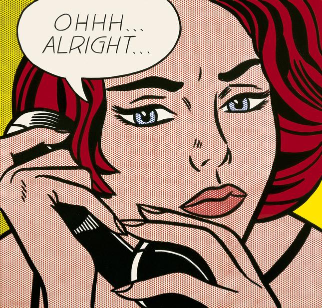
Ironically, the decline of print media gives his work even further authority. Lichtenstein spent his career working in an aesthetic language culled from newspaper printing techniques of the day, using predominantly primary colors, black and white, and mimicking the process of Ben-Day dots to create gray tones and secondary colors (ultimately, the dot became his lasting visual signature). The employment of these printing techniques is now all but extinct. An audience under the age of 15 might not intuit Lichtenstein’s visual language at all, which defeats the work’s purpose almost entirely.
This now post-retro appeal adds a eulogizing loveliness to his work and shows us how far we have traversed the path. If half a century ago, Lichtenstein was already aware of media oversaturation, and since then we have continuously expanded and streamlined its outreach, are we even aware of its effects anymore? Who knows how many symbols we are numb to? Like myself, most of you readers probably make your living by running your fingers over identical keyboards, whose patterns you trace and retrace endlessly.
This in itself proves to be a fundamental nature throughout Lichtenstein’s surprising and expansive career: it is not the idea that is unchanging—it is the medium, the language that stays the same.
Looking at his oeuvre, the appropriation and stylization of pre-existing material is constant. It did not start or end with the Comics page. “I think even the old audiences still think of Roy as just doing cartoons,” said Dorothy Lichtenstein, who previewed the exhibit. “There were three years really that he did that, and then there’s a body of work that’s so different.”
In an early work on display from 1951, “Washington Crossing the Delaware,” Lichtenstein took the iconic image and reduced it to something like a child’s art homework. It bares no resemblance to the clean graphic style he would develop a decade later.
The exhibition follows his career from the 1950s to his death in 1997, offering an extensive look at his various styles and interpretations. His first pop painting, “Look Mickey,” part of the National Gallery’s collection, is a centerpiece of the show. Lichtenstein’s stark and nearly unfashionable portrait of Mickey Mouse and Donald Duck not only launched the artist’s career, but helped change modern notions about art.
A walk through the exhibit begins with paintings of sneakers, a hot dog, a cup of coffee, a sponge, and the ominously vague painting “Spray,” which could be anything from window cleaner to pesticide.
When shown together, his landmark 1960s paintings of war and romance comic panels carry a unique and unexpected punch; the shock and interest feels like it must have when they were first displayed in major New York art galleries.
He reinterpreted works by Picasso, Cezanne, Monet, de Kooning and Gilbert Stewart. He ventured into the realm of ancient Egypt, architectural moldings, often amalgamating genres—his cartoon nudes fall somewhere in between Renoir and Li’l Abner.
More surprising and nearly breathtaking are his landscapes composed of fields of his small dots, which go hand in hand with his interpretations of Japanese woodblock prints. The harmony, balance and beauty Lichtenstein achieves are almost an antidote to his rigid, pulpy, high-strung comic paintings.
Throughout this exhibition there is a wonderful humor, irony and curiosity. As Dorothy pointed out, it is a reflection of her late husband.
Lichtenstein said in 1964, “The things I have apparently parodied I actually admire.” This is not art meant to incense, but to invigorate, to carry with us as we leave the gallery. Perhaps this is why the paintings can seem out of place in a museum—they are meant for the outside world. Let it pervade our collective consciousness a little, and it might shed light on our time, our place, and each other. With a wink and a smile, of course.
A smile was indeed on my face as I walked back to the metro, looking for that giant white “M” as a thousand Starbucks mermaids flirted with me from the cardboard latte cups in the hands of every passerby. Although maybe that was just a coincidence. I was, after all, within a block of two Starbucks.?
“Roy Lichtenstein: A Retrospective” will be on view at the National Gallery of Art through Jan. 13, 2013. For more information visit www.nga.gov.