Tech Tip: How to Turn Your Excel Sheets into Heat Maps
By • June 5, 2023 0 845

From Computerware, Inc.,
My team and I are big fans of a good spreadsheet, just as a simple way of organizing and contextualizing your data. Therefore, we’re all for sharing some neat ways you can make these visualizations tools for better presentations.
Let’s talk about how you can make your Excel spreadsheets into a heat map, giving you this kind of increased visibility.
What Is a Heat Map?
Simply put, a heat map is a way to represent data in a way that quickly communicates the deeper context the data provides. According to TechTarget, a heat map is “a two-dimensional representation of data in which values are represented by colors. A simple heat map provides an immediate visual summary of information. More elaborate heat maps allow the viewer to understand complex data sets.
Think of it this way… Let’s say you had a collection of data you wanted to summarize in such a way that a quick glance could give you a pretty good impression of what the data was trying to communicate. A heat map is one of many ways that Excel allows you to do so.
Let’s run through a scenario to demonstrate how to use this feature.
Maybe You Wanted to Be Sure Your Team Was Using Their Available Time Off…
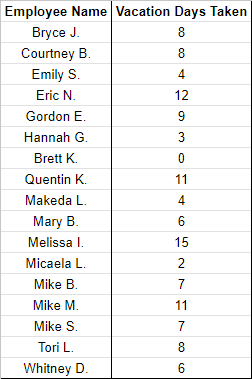
Let’s say you had a team of 15, who were all accumulating paid time off. Now, there are various reasons you should want your team to use their available time, and that you’d want a way to keep track of where your team was concerning that goal.
Microsoft Excel gives you an easy option. In whichever workbook you want to use to keep track of this data, create a list of your employees’ names and the number of vacation days each has taken.
Highlighting the names and their number of days taken, select Format from the menu and click into Conditional formatting.

Once the Conditional format rules window opens, select + Add another rule and then select Color scale.
You’ll then see your selected range defined in the Apply to range box, with Format rules available for you to fill out. Under Minpoint, make sure Min value is selected, and select the color that will best communicate to you what this means. For this example, we’re trying to determine which employees have used the least number of their available days, so we’ll go with red, as it’s a bit of a red flag. Under Maxpoint, do the same, but select Max value and select a different color. Since these employees are the ones who are using enough of their vacation days, we’ll use green.
For Midpoint, use the number between the highest and the lowest. For our example, we’ll estimate that this value is 7.
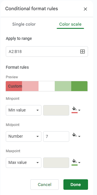
Click Done, and you should see quite a nice and legible result, making it clear who needs to use more of their time and who is in good shape.

Of course, you can use this trick for a huge assortment of data types and purposes.
Hopefully, this little trick will give you a bit of utility moving forward. Don’t forget to consistently check back for more useful tidbits, and remember that you can always lean on the team at Computerware for the technology assistance your team will need.